
Professional Office Skills (Word, Excel, PowerPoint)
Module 1 · Module 1 — Word: Writing Professional Documents · Lesson 1 of 1
Basic formatting (font, paragraph, alignment)
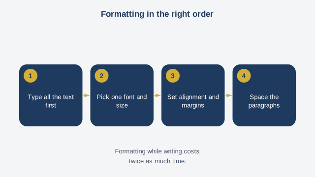
Word is mainly used to write documents that are readable and well presented — a report, a letter, a CV. Before going further, you need to master three basic settings that immediately change how a text looks: font, paragraph, and alignment. The font is the style of the letters. Word offers several by default — Calibri, Arial, Times New Roman. For a professional document, favor a plain, readable font over a fancy one; Calibri or Arial at size 11 or 12 suits the vast majority of documents. To change the font, select the relevant text by clicking and dragging over it, then choose the font you want from the menu at the top of the screen. Alignment determines how text sits on the page: left (the most common), centered (for a title), right, or justified (the text stretches to touch both margins, often used for a long body of text). The four alignment buttons are usually next to each other in the ribbon at the top. Finally, character formatting — bold, italic, underline, color — lets you make an important word or sentence stand out, but sparingly: a document where everything is bold or colored loses its effect and becomes hard to read. Use these effects only for what truly deserves to be highlighted. For this lesson, open a new Word document, type a short paragraph, then change its font, apply centered alignment to a title, and bold one important word.
Free preview, no account needed — the rest of this module and the following modules unlock after enrolling.
Convinced? Enroll to unlock the full course.
See pricing