
UX/UI Design & Product Design with Figma
Module 1 · Module 1 — UX principles · Lesson 1 of 1
UX principles
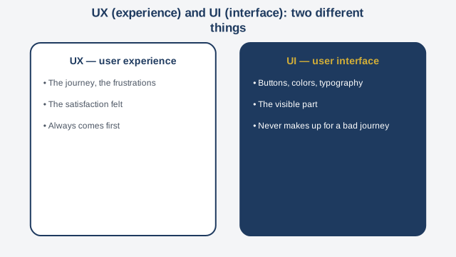
Welcome to this course on UX, UI — user experience, user interface — and product design with Figma. In this first module, we establish a simple but often forgotten idea: before drawing anything, you need to understand the user. UX stands for user experience: everything a person feels while using a product — their journey, their frustrations, their satisfaction. UI stands for user interface: the visible part, the buttons, colors, typography. A beginner designer often confuses the two and jumps straight into the interface without having thought through the experience first. It's the most common mistake in the field. Take a concrete example. A local food-ordering app has a beautiful design, with polished colors and elegant icons. Yet its conversion rate — the share of visitors who actually complete an order — stays very low, around five percent. By observing real users, the team finds the problem: the checkout button is hidden at the very bottom of a long screen, after a list of optional add-ons that almost no one fills in. The interface is beautiful, but the experience is poor. This example illustrates this module's central principle: a beautiful interface never makes up for a poor user journey. The reverse can also be true — a simple, almost plain interface that converts very well because the journey is smooth and logical. To design with the user in mind first, three questions should always come before the first sketch or the first click in Figma: who uses this product, what problem are they trying to solve, and what is the main obstacle that currently stops them from doing so easily. In the modules ahead, you'll learn to concretely answer these questions through user research, then translate the answers into wireframes, a styled interface, a design system, a tested interactive prototype, and finally a clean handoff to a development team. To close this module, a case study: back to the food-ordering app. After moving the checkout button to the top of the screen, always visible, and removing the mandatory add-ons from the list, the conversion rate rose from five to eighteen percent — with no aesthetic change at all. The takeaway: design that works always starts with understanding the need, not with aesthetics.
Free preview, no account needed — the rest of this module and the following modules unlock after enrolling.
Convinced? Enroll to unlock the full course.
See pricing